LING'sCARS.com Redesign

An attempt at a redesign of Ling’sCar.com, dubbed "the UK's craziest car leasing website! I was responsible in creating the wireframe/concept to show how this redesign looks like.

Project Context

Web & Mobile Class
May 2023
Tokyo International University

My Role

UI/UX Design
Wireframing

Deliverables

User Interface

Tools Used

Adobe Photoshop

Background

Our lecturer gave us a group project task: we are to come up with a new redesign of an existing business's website that is cluttered and has a non user-friendly layout. These issues could potentially lose out on customers and fail to retain current ones. We chose to do a redesign of Ling'sCars.com.
Ling'sCar.com is an eccentric car leasing website based in the UK. The business provides car or van leasing, and its homepage allows customers to choose from its many offerings. The owner prides herself on having "The UK's craziest car leasing website!" and it shows in the unusual website design. Although their website's design is unique and stands out, it is very cluttered and not quite legible. Our motivation for this project is to create a new website that retains the eccentricity of the owner while creating better structure to be more easily understandable for users. In doing so, we aim to hypothetically increase visitors to the website and increase sales at the same time.

Ideation

Problem Identification

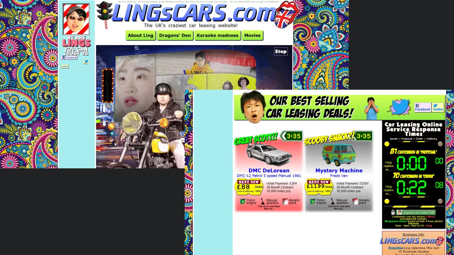
The problems that we were able to point out were various. It features a bright yet distracting color palette, with images of the owner's face plastered throughout parts of the website. There is an overload of GIFs throughout, a prominent background, and the use of multiple fonts that are not paired well together. The website creates the impression that it is a personal blog instead of a business.

Additional problems spread throughout the website are the cluttered categorization of information on the website. Click boxes are hard to guess, menus are not collapsed making the homepage unnecessarily long, and unrelated information takes up space on the homepage.
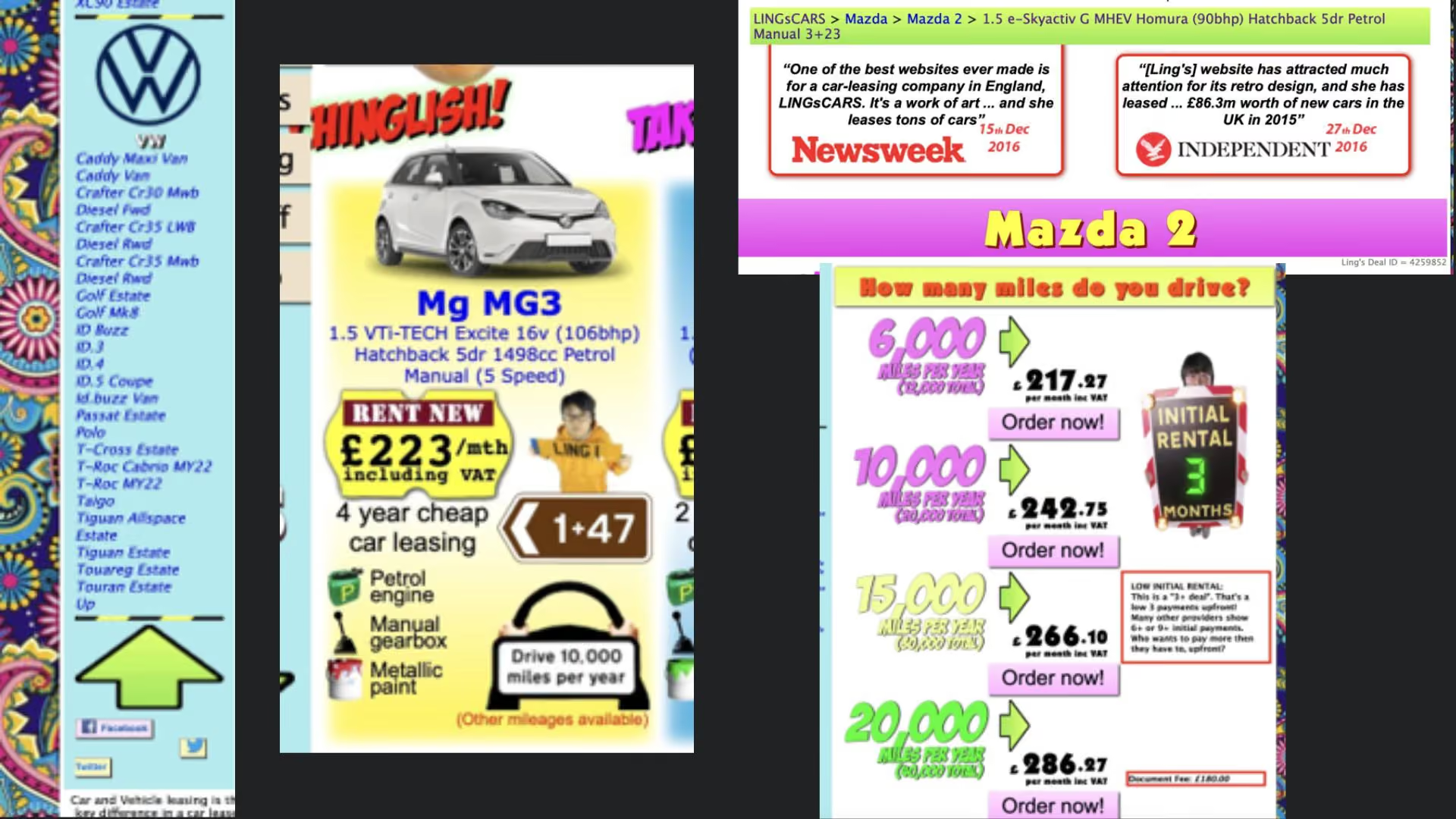
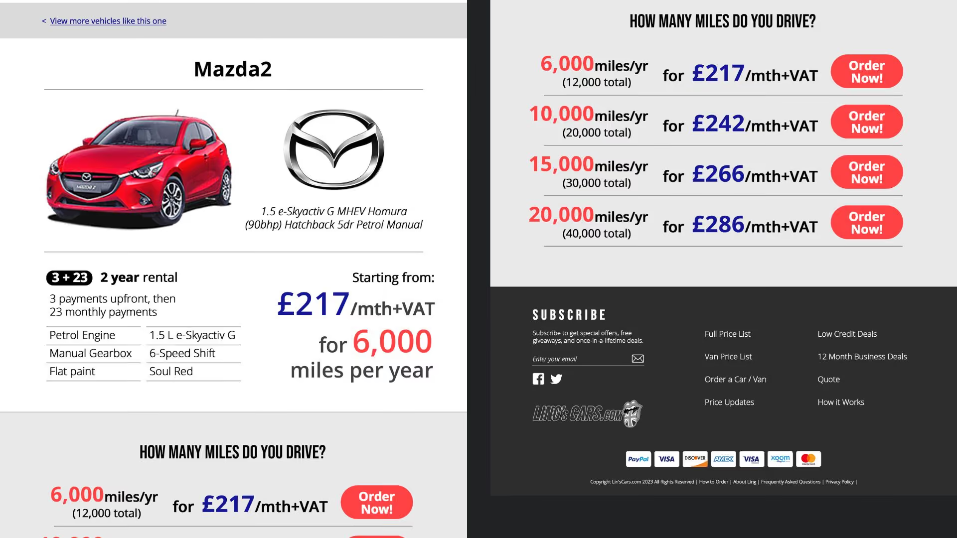
Many of the car listings on the homepage like the one for "Mg MG3" has no clear indicator on where the user can or cannot click, as all the information is given the same emphasis and no emphasis on a clickable area. Inside the product page, for example in Mazda 2's page, the first thing being shown is not the car itself, but news article about Ling'sCar. These testimonies are incorrectly placed and should not take precedence over the detail of the car.

Implementation

Redesign Choices

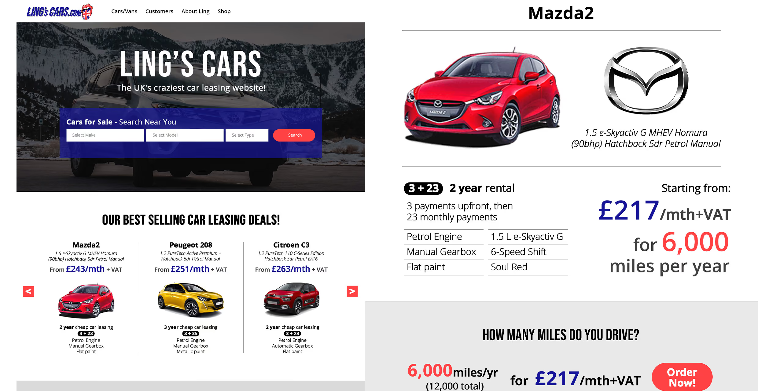
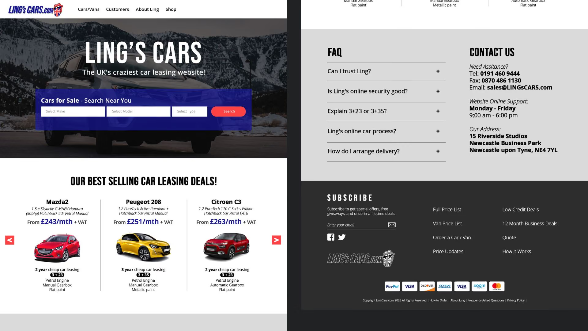
We chose to redesign the homepage and product page. The background is replaced with a plain white color, we changed all the fonts to just Helvetica, animations that are considered taking attention away are removed. Menus are moved to the navigation bar, and sections about Ling and the company are all consolidated into one menu titled “About Ling”. A search function for the website is added alongside a picture of the featured car at the time as a background.

The next section is the featured car deals section which contains a carousel of car recommendations, and it is swipeable with the red button on each side. Moving further down is the FAQ section, with a dropdown FAQ and contact information on the side.
Next is the product papge. The most important part here is the car itself and the car brand. Thus, the car name, car image, and information about the machine takes priority and is displayed in a large portion of the page. Underneath that, other related information to the car are made compact, and the lease price is moved to the top and takes priority. The next section contains more information about the car mileage and the option to order. This section is highly condensed from the old website so that it is comfortably viewable in one page without scrolling.
After finishing these mockups in Photoshop, I send it over to my programmer friend, and he made an interactive prototype using HTML and CSS.

Outcome

The expected impact of this redesign is increasing user retention and engagement. The new functionalities, such as the search function, clickable scroll, and email subscription form, will enhance the user experience and provide additional convenience and interactivity. The search function will allow users to quickly find specific information or car leasing deals they are interested in, improving navigation and reducing the time it takes to locate desired content. The clickable scroll feature will enable users to easily navigate through the best car leasing deals section, enhancing engagement and increasing the likelihood of conversions. All these factors can then lead to higher search engine rankings and more organic traffic from search results.

We presented our redesign the next month in front of class, and it was generally received to be an improvement in terms of clarity and structure. However, one main criticism we received was that we changed too much of the brand identity and we failed at preserving the eccentricity of the site. In a sense, the website became no longer unique, and that was a criticism I take to heart and I became more mindful about the brand's soul when making a redesign.

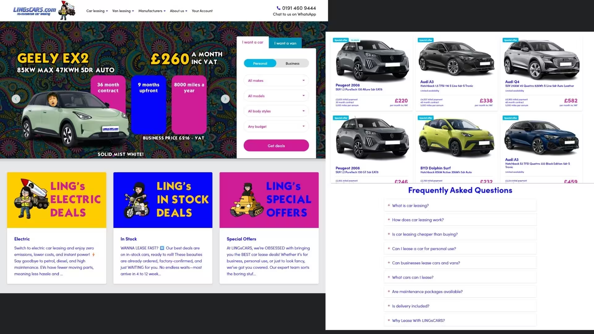
Three years later after this little class project, I was curious to see how Ling'sCar.com is doing now, and was taken aback to see that they actually had gone through a makeover. Reflecting the work my group did, I was pleasantly surprised to see that some of the changes we did were similar to what they did here.
Although the website became massively different in terms of its branding, what's different to my group's redesign is that this one preserves Ling's eccentricity and character. (Link to the old Ling'sCars.com)